Wait stats is my go to thing, however I do get bored just querying it via a table so I decided to broaden my horizons and see how “analytical” I could get with it via Power BI.
What I usually do is that I create a table and dump the contents of a famous waits stats script (*cough * Paul Randal, his code- NOT mine http://www.sqlskills.com/blogs/paul/wait-statistics-or-please-tell-me-where-it-hurts/) and all I do is put a timestamp on which I really want for time based analysis.
From there I can usually write some queries to see a trend – that is if one does exist.
Something like:
select * from dbo.WaitQueues
where waittype ='IO_COMPLETION' order by SampleTime
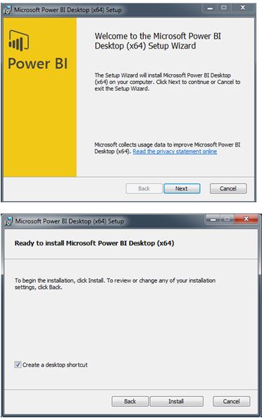
Anyways, I want to see Power BI in use now – first you need to download the Desktop version and install it. From https://powerbi.microsoft.com/en-us/
Select Get Data to setup a connection to your table.

You should then be able to preview your data.

Once the data has been loaded you can get creative – I am not creative at all! So if you are a Power BI person I apologise in advance.
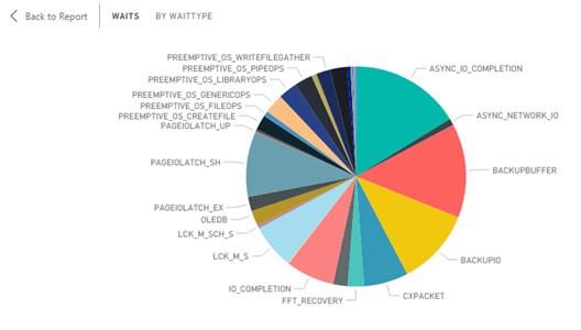
The first pie chart shows the Summary of my waits at a specific time.
This is the pie chart at a different time point.

You can drill into a section of the pie chart to return the underlying details.

If you do not like using pie-charts you could switch to a tree map. This was me using CHECKDB heavily.

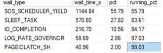
I wanted to see some visualization of what has happened to a specific wait over my time intervals.
For the below I selected WRITELOG over my time samples.

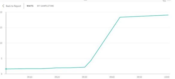
What about PAGEIOLATCH_EX?
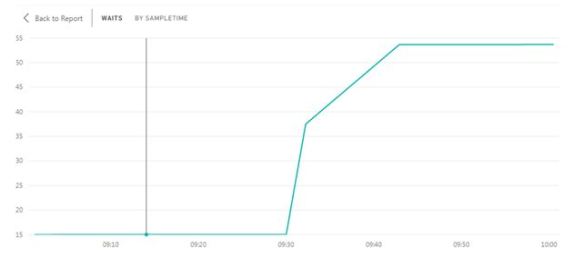
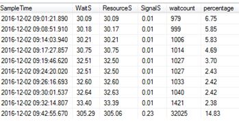
What about CXPACKET analysis?
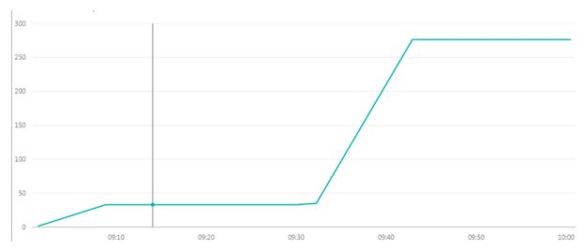
So what on earth happened at 930? Yes that was me going crazy with poor performing queries on a poor performing disk!
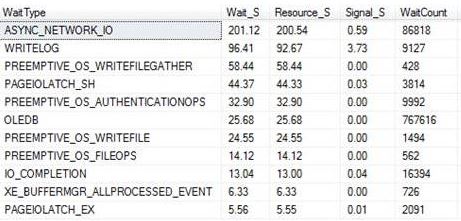
For the next example I decided to use a stacked bar chart looking at a selection of wait types only at a specific time interval. (9.08am)
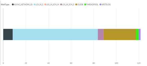
That light blue (I think) colour seems to take most of the chart, that being LCK_M_S – you can then drill into it for more details.

(Yes that is a link to the awesome sqlskills waits library, yep I helped gather some data for that)
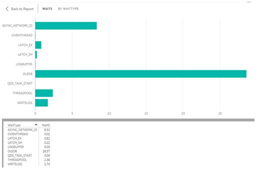
Or if you prefer a standard bar chart can be used, below concentrates on Wait (S) per wait type encountered.
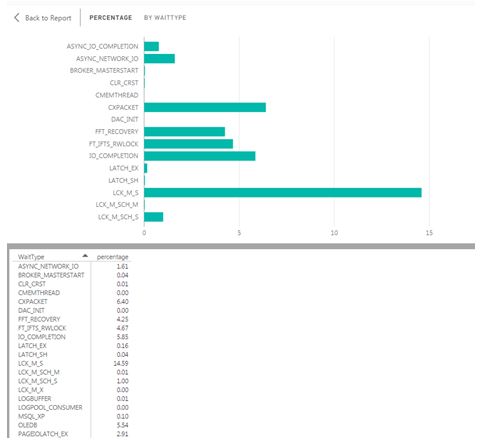
Or changing the filters you could go by percentage per wait type.
Finally I get slightly more creative with signal wait times (red).

I am really enjoying this sort of analysis; it is a nice change from writing queries. Give it ago!